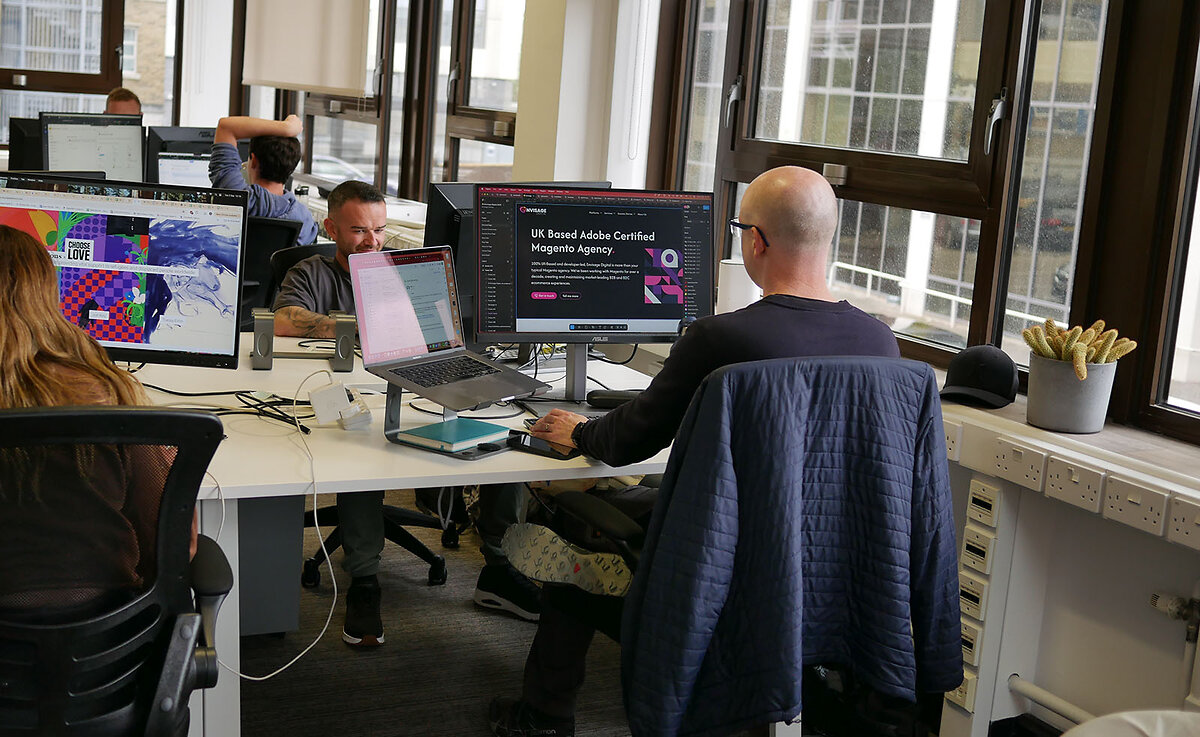
Responsive Website Design Development.
Harness our expertise in fluid design to ensure your website looks and functions perfectly on every device. Delivered by our in-house design professionals, we’re just a call away to bring your digital vision to life.
Why Responsive Design is Essential for Today's Web.
In an age where digital users are increasingly varied in their device choices, having a website that adapts seamlessly is not a luxury—it’s a necessity.
Many website owners discover that their sites aren’t optimised for all devices, leading to user frustration. When a site doesn’t display correctly, potential clients are likely to leave and seek out competitors. Our responsive designs ensure that your website looks pristine, regardless of the device.
The surge in mobile device usage means a significant portion of your audience accesses your website on-the-go. A site that fails to adapt can result in lost business opportunities. We craft designs that cater to mobile users, ensuring you capture this vital market segment.
Website loading times can vary across devices, and a slow site can be detrimental. Users often abandon slow-loading sites, costing businesses valuable conversions. Our responsive design services optimise load times for every device, enhancing user satisfaction.
SEO rankings can be negatively impacted if your website isn’t mobile-friendly. Lower rankings can result in decreased visibility and reduced organic traffic. By prioritising responsive design, we ensure your website stays competitive in search engine results.
Periodic device updates can render some website elements obsolete or dysfunctional. This unpredictability can result in compromised user experiences over time. Our designs are forward-thinking, ensuring longevity and adaptability to future device innovations.
Businesses often find it cumbersome to manage multiple website versions for different devices. This can lead to inconsistent branding and increased maintenance costs. With responsive design, we provide a single, cohesive website solution that simplifies management and strengthens your brand.
Responsive Design That Scales as You Grow
Imagine creating a user experience for your website that automatically scales to all device types. Responsive web design is not just a mobile-friendly website: it’s the future of functionality.
At Envisage Digital, we help you achieve high search rankings through a responsive website design that automatically adjusts all your web pages to look perfect on different devices.

Our Responsive Web Design Services .
Over 50% of search traffic comes from mobile users, but maintaining several versions of your site for different screen sizes isn’t feasible in the long term. The answer? One responsive, future-proof site that works for all devices. Here’s how we help you master a custom, responsive website.
Navigation Redesign
Header-based navigation may be fine on larger screen sizes, but you need an adaptable, easy-to-use solution for smaller devices. We design intuitive menus that can collapse and resize based on device width.
For example, the mobile version can include a collapsible “hamburger” menu for simple user access and reduced screen space.
Typography Optimisation
You want your users to easily read your copy on small screens and desktop computers. Typography optimisation can include automatically adjusting the copy size, capitalisation, font style, colours, min-width, white space, line heights, spacing, and more so everything makes sense for specific devices.
We nail the details to provide your users with exceptional experiences.
Responsive Images
You spend time creating and selecting quality images for your website. You don’t want to lose that quality when the image appears large on desktop computers or small on smartphones.
Responsive images automatically resize and adjust the resolution to match the available space. These images reduce load speeds, which can also help your website rank higher.
Touch-Friendly Interactive Elements for Mobile Devices
Selecting links, buttons, and other interactive elements on smaller screens isn’t always easy. You don’t want to defer your smartphone users from taking important actions, so you need touch-friendly elements for mobile use.
We design interactive buttons with more space and adequate sizing so your users on mobile phones or tablets won’t have issues navigating your website.
Speed Optimisation
Slow loading speeds can harm your website’s search engine ranking, even if you only have one slow web page or a mobile version with issues. Your desktop and mobile users expect near-immediate load speeds, so we help you deliver.
Speed optimisation includes numerous tactics, like minifying code, organising HTML structures, compressing images, reducing CSS, and more. Our product design team can target slow-loading culprits to help your site load at lightning speed.
Accessibility Features
Website accessibility extends beyond creating a mobile-first design. You must ensure that all users, including people with disabilities, can interact with your content. Our web designers always include accessible features like alternative text for images, resizable texts, and proper ARIA labels for website screen readers.
Adhering to these guidelines is not just good practice but necessary for your business to reach as many people as possible. We help you create styles that look great and function well for all audiences.
Adaptive Content for Any Screen Size
Prospective customers want to know if they’re making the right choice to invest in your product or service. Testimonials, case studies, or the logo of a professional partner can “wow” an audience.
If you have an e-commerce site, you should also consider posting security badges for the encryption services you use when dealing with secure online transactions.
Mobile-Device-Friendly Forms
Filling out forms on mobile devices shouldn’t be hard. You want your users to take that step to contact you, so your forms should be mobile-friendly, convenient, and intuitive. By taking a mobile-first approach to forms, our web designers can focus on creating appropriately sized input fields, touch-friendly buttons, and clear error messages.
Your forms can extend to fit larger screens, like tablets or desktops as well. Anyone who wants to contact your business will have a simple, visually pleasing experience.
Lazy Loading
Lazy loading allows you to control when all items on the page are displayed. Rather than making users wait for the entire page to load, non-critical assets will load as they scroll, offering more instant experiences.
A large aspect of creating a mobile-friendly website is crafting a fast, convenient experience. Lazy loading significantly improves page speed times, especially on mobile phone devices with longer scrolls and slower connections.
Testing on Different Screen Sizes
After we’ve created your responsive website design, we test responsiveness across all device types, screen sizes, and browsers. One browser may show your product design page differently from another, just as your media can load incorrectly on mobile websites.
Our designers check all possible scenarios, such as viewport meta tag scrolling, landscape views on mobile, form errors on tablets, and more, to ensure that your website functions perfectly.
Ready to start designing with us?
Book a consultation with our experts
Responsive Design: A One-Time Investment That Keeps on Giving
Responsive web design is an intelligent approach to website construction that allows you to build one site that automatically adjusts to all devices and browsers. The hands-off approach offers you numerous benefits as a business owner. Anytime you need to update content, you can make the change, and your responsive website design will still look great across mobile phones and laptop devices. Forget the manual labour of building five websites in one for all different devices — choose the web design that easily scales with your company’s growth. With a responsive web design, you can unlock the following benefits:

How We Transform Your Website Into a Flexible, Optimised Force
At Envisage Digital, we use a thorough six-step process to fully understand your user base, market needs, and design requirements before delivering the optimised, mobile-first website.
Consultation
First, meet with our designers to discuss your business goals, audience, and design preferences so we can begin developing ideas for your website.
In-Depth Market Research
Next, our designers and development team conduct thorough market research to understand your audience, their needs, and their most-used web platforms.
Mobile-First Design
Our designers prioritise mobile-first, visually appealing, and responsive designs that can extend to virtually any device or screen size.
Development
During the development phase, our designers use the latest technology, SEO practices, and optimisation tools so your website performs well. We create evergreen sites that won’t require constant updates in the near future.
Testing
We carefully test your website across all browsers and devices, from mobile phones to tablet screens, to ensure that every experience functions correctly.
Launch and Support
After rigorous testing, we launch your mobile-first website, monitoring its optimised performance across search engines as it attracts mobile and desktop users alike.
Choose the Top Responsive Design Agency for Your Site Makeover
At Envisage Digital, we specialise in fully custom responsive web design. When you’re ready to join the mobile-first design movement and modernise your website, contact Envisage Digital to meet with a web designer from our responsive website design team.
FAQs
How Does a Responsive Web Design Differ From a Mobile-Friendly Website?
Responsive web design uses a mobile-first approach that automatically scales all aspects of the website to fit any screen size. Conversely, mobile-friendly websites require you to build multiple versions of your website for every device size.
What Are the Core Elements of a Responsive Web Design?
The three core aspects of responsive web design are fluid grids, flexible images, and media queries. These components work together to create a seamless user experience across all devices.
Do Responsive Websites Work on All Screen Sizes?
Responsive websites work on all device sizes, from tablet devices and mobile phones to desktops and laptops. The flexible design can automatically adapt to any new device’s shape or size.
Does a Responsive Web Design Automatically Adjust Font Size?
Responsive websites intelligently adjust typography size to fit the device size. For example, a tablet user may need larger fonts than a desktop reader. You can even control what copy you show to each device on your website.
Do Responsive Websites Rank Better in Google?
Responsive websites can rank better in Google and other search engines because they prioritise the mobile-first design and offer fast loading speeds. Google ranks fast websites higher, particularly those with excellent mobile experiences. Your responsive website design can help you adhere to various SEO best practices.
Did you find what you were looking for?
Ask a question